Wood door colors – what do they really look like?
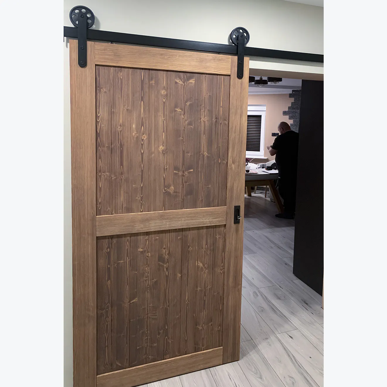
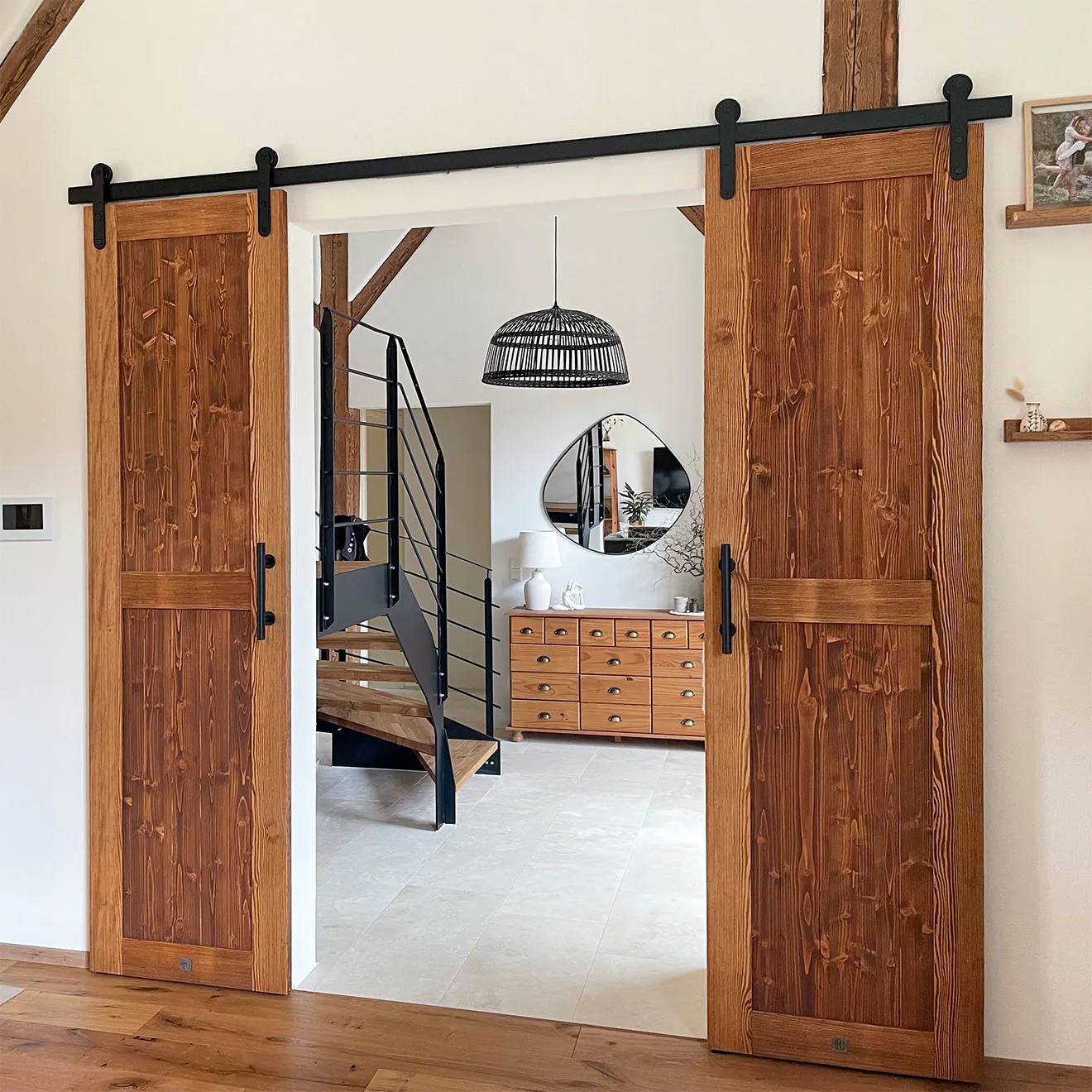
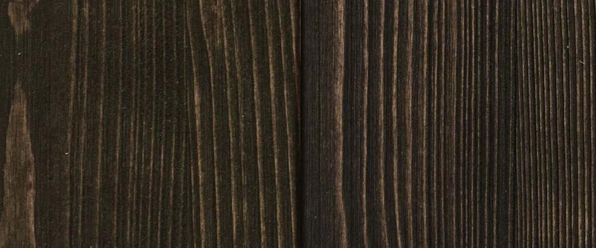
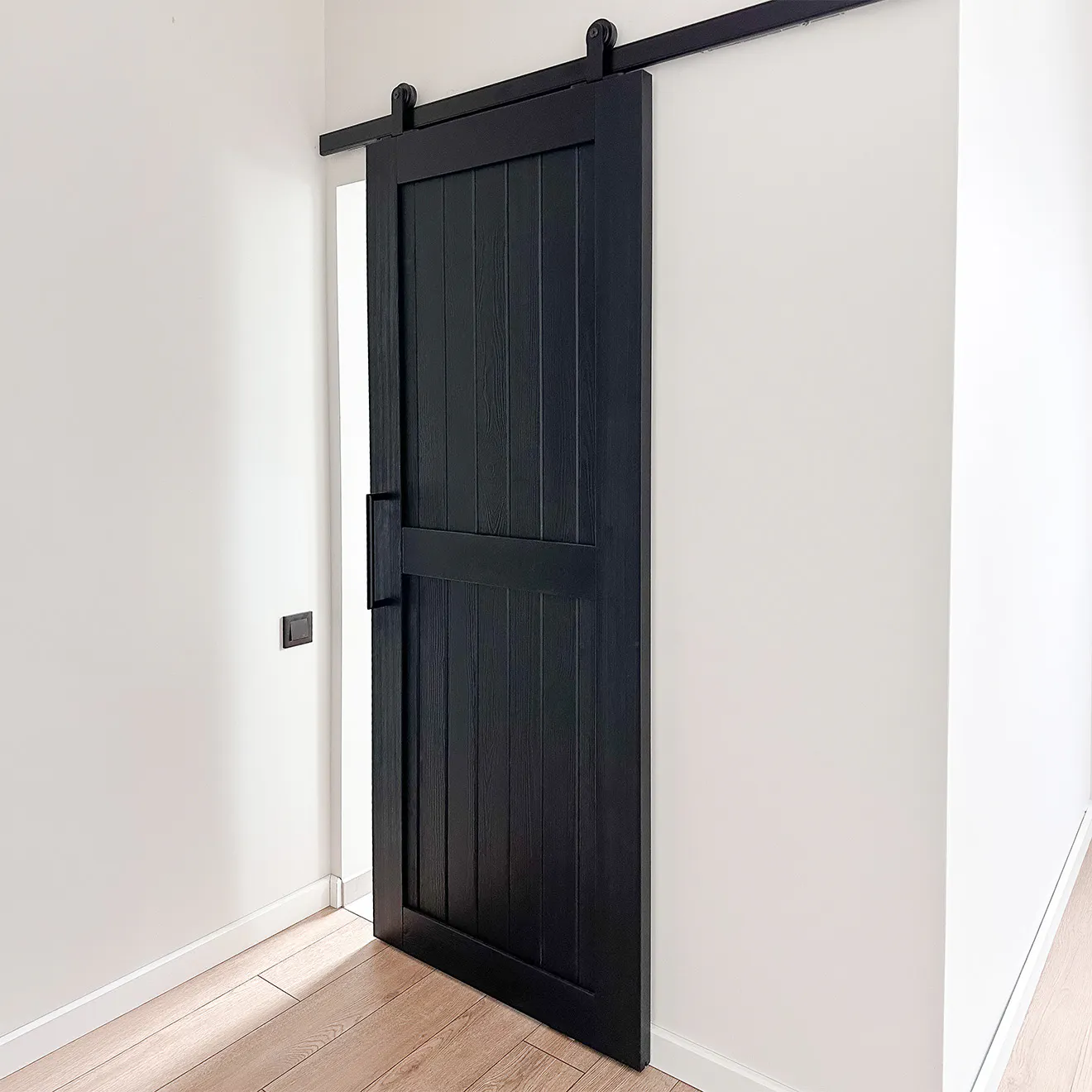
Choosing a color for wood doors isn't easy. It's about so much more than just picking a 'beautiful shade' from a palette. And it's not just because there are so many options. The biggest doubts usually come when looking at photos. The same shade can look completely different – sometimes warm and bright, other times cooler or much darker.
That's completely normal. Wood is a natural material, so the color 'lives' and changes along with the wood grain, the light, and your surroundings.
In this article, we show you our complete color palette along with real customer photos taken under natural conditions. This way, you can better understand how each color really looks in reality.
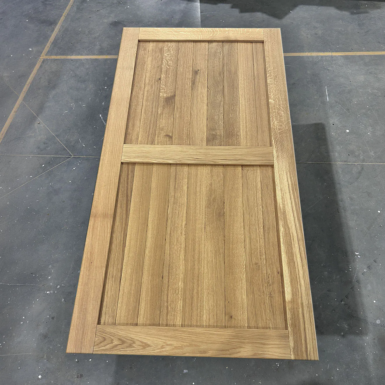
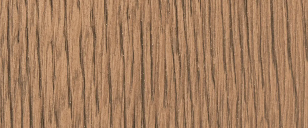
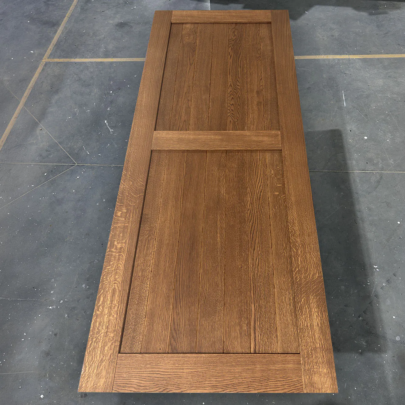
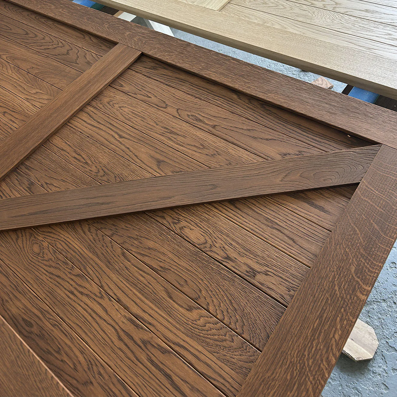
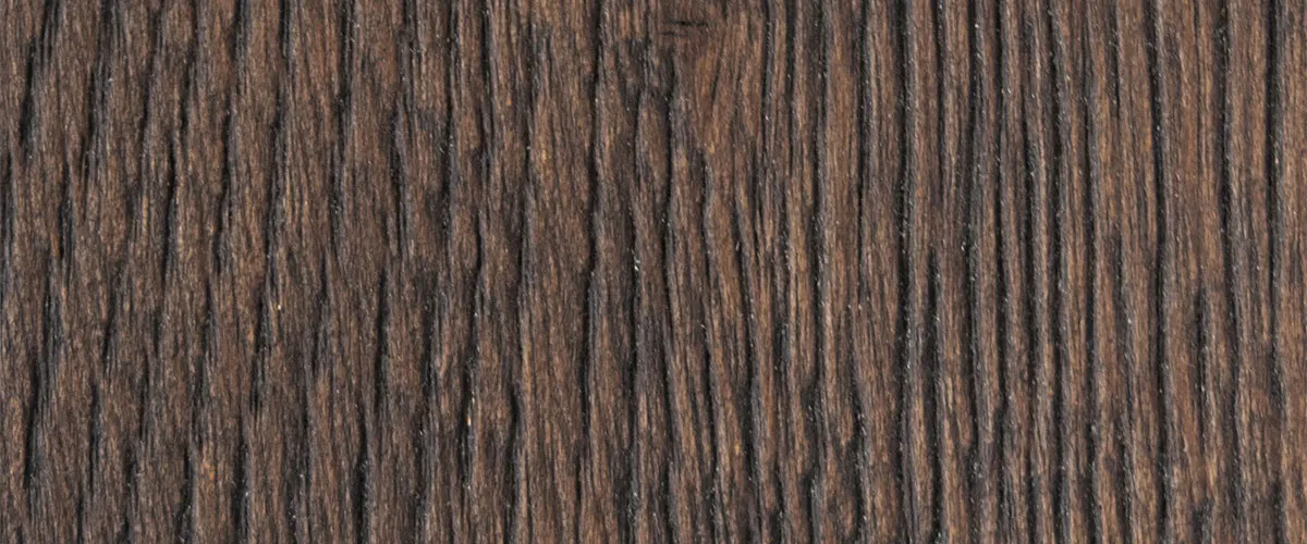
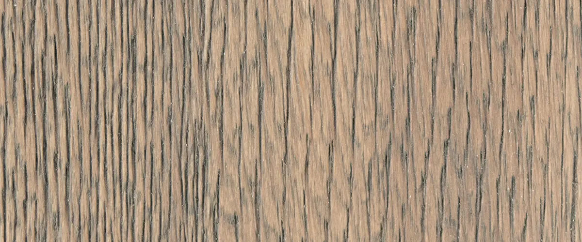
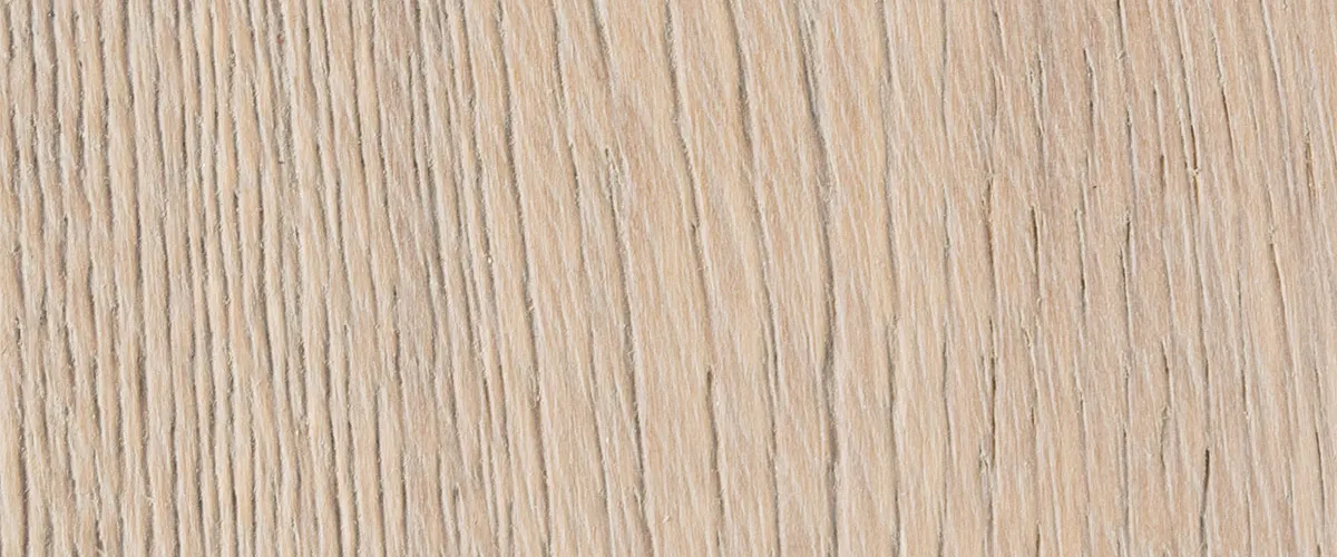
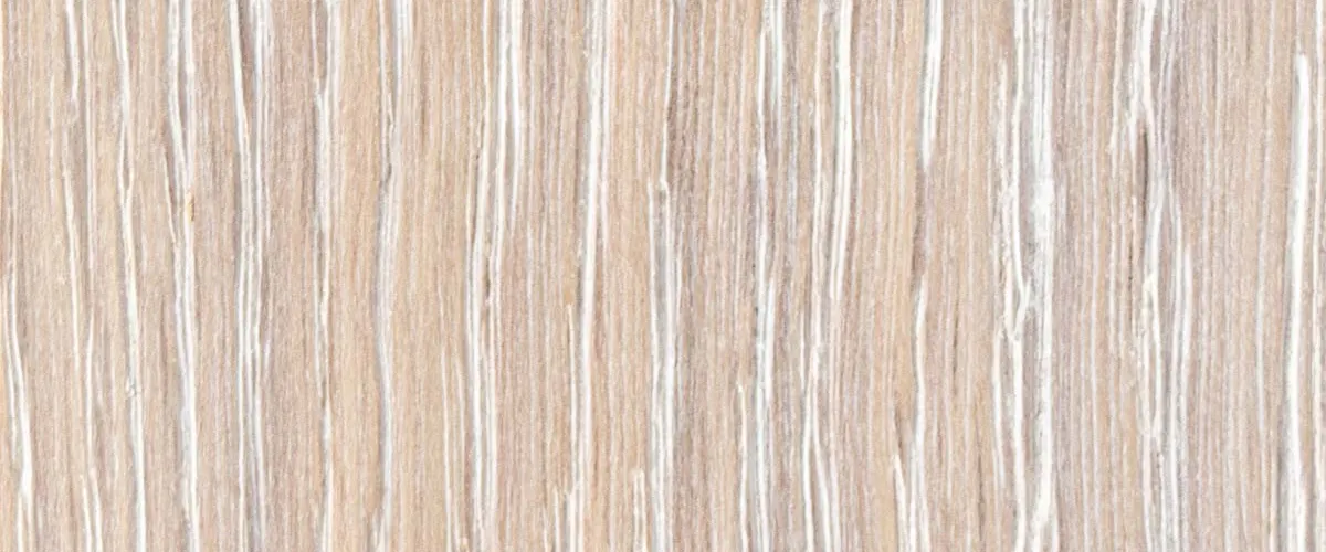
Oak – the complete color palette
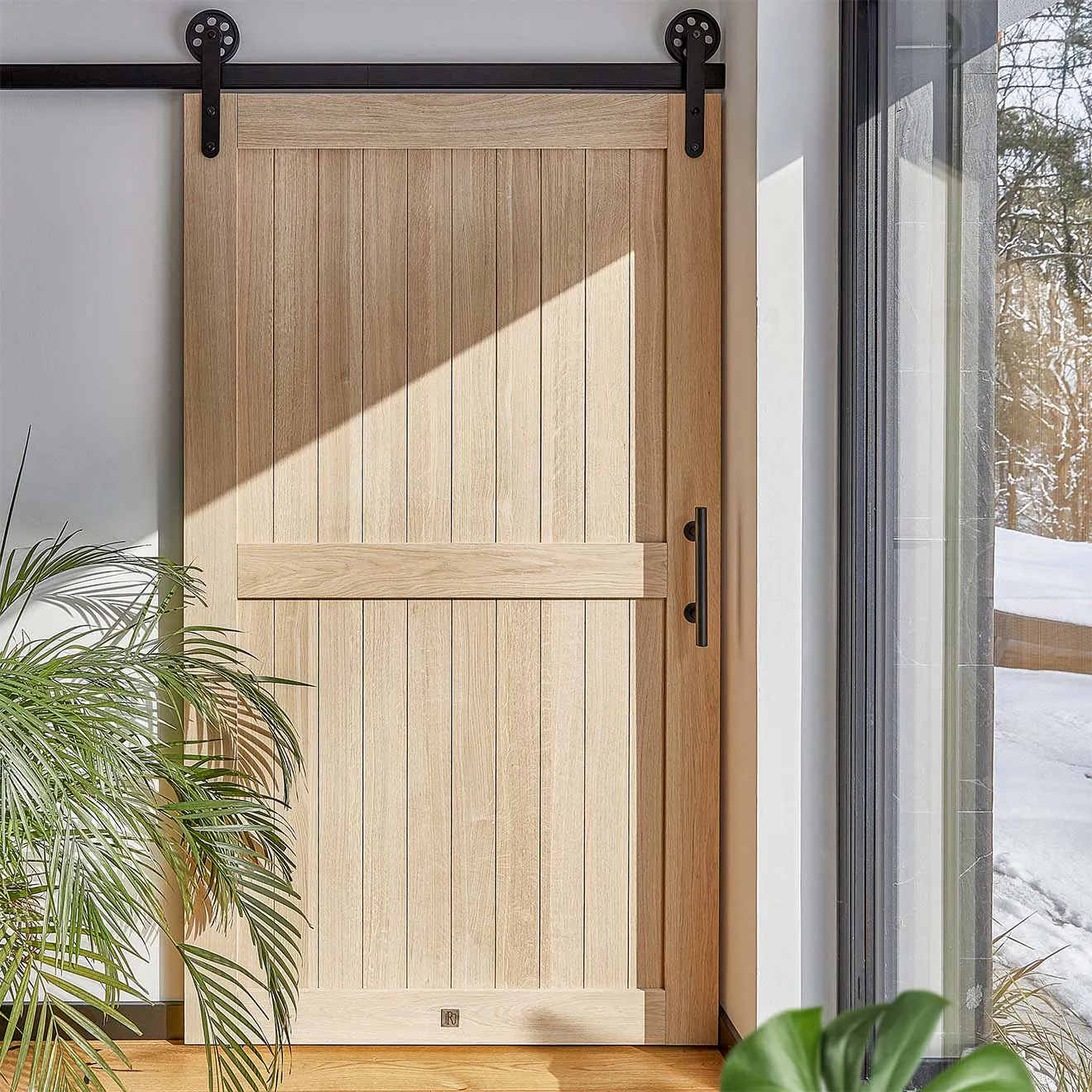
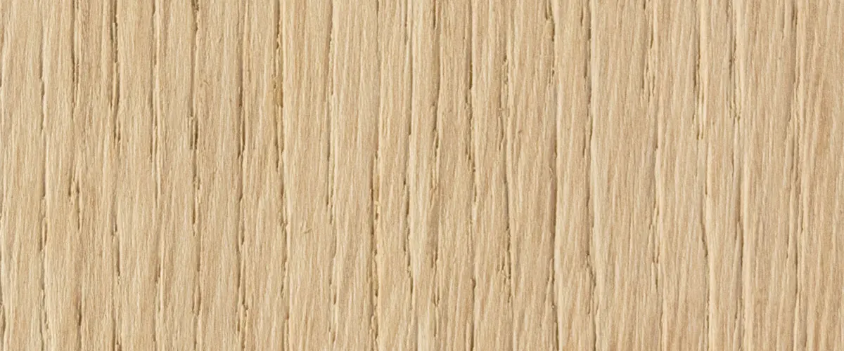
Oak is harder and has a tighter grain than pine. That's why the same oils and shades look slightly different on oak – usually richer, deeper, and a bit darker.





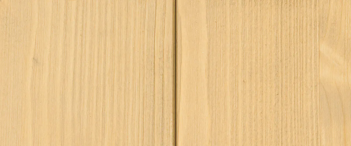
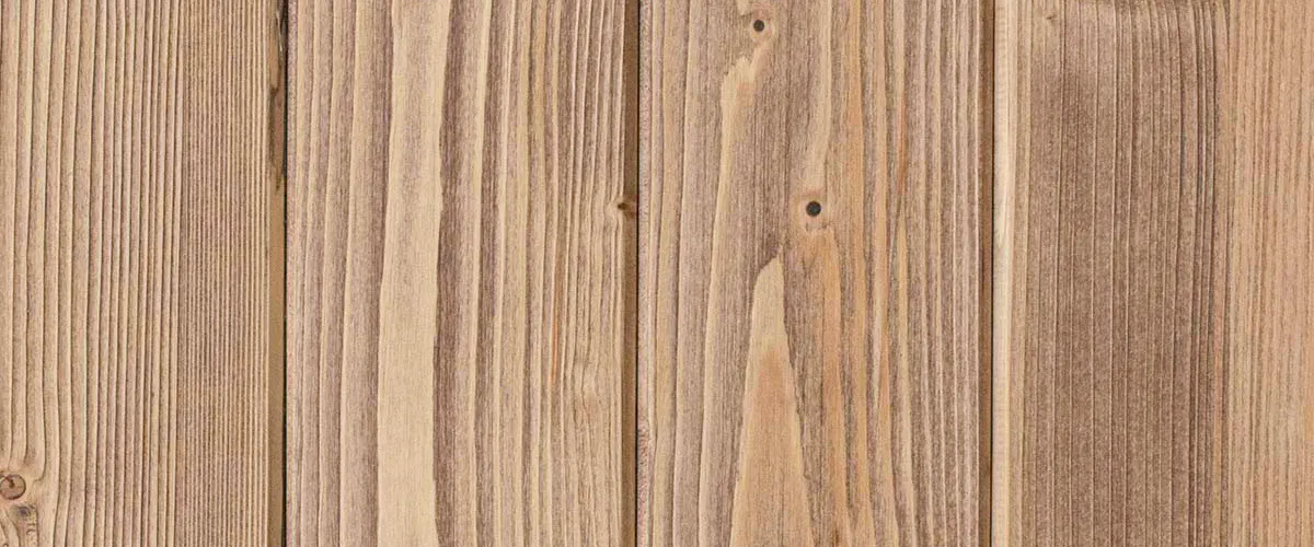
Pine – the complete color palette
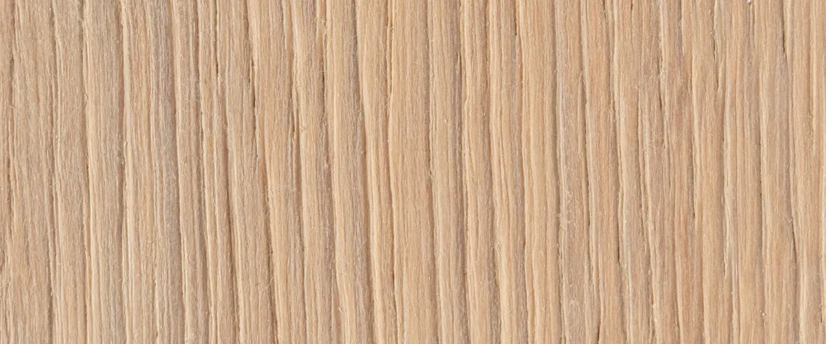
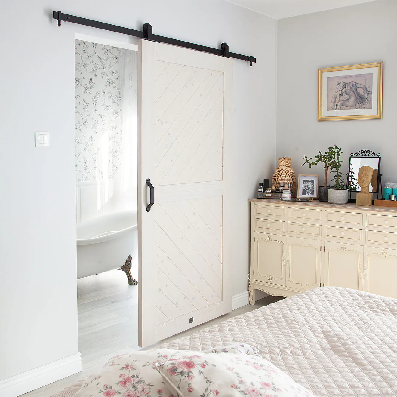
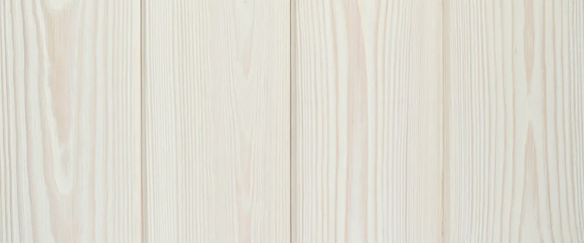
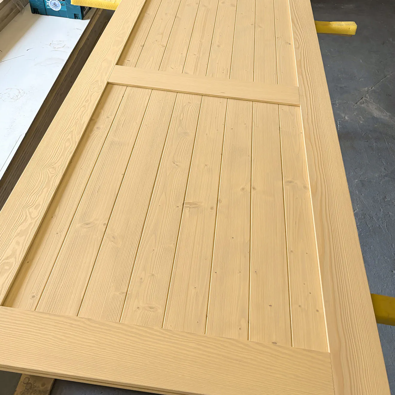
Pine is a forgiving wood that absorbs pigments and shades beautifully. Thanks to its pronounced grain, the colors look natural and vibrant.






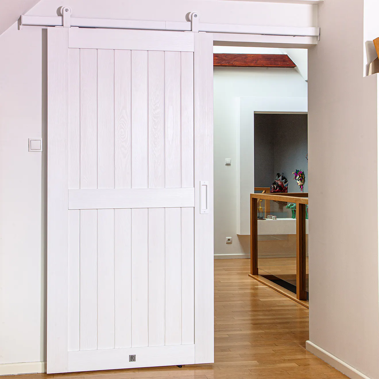

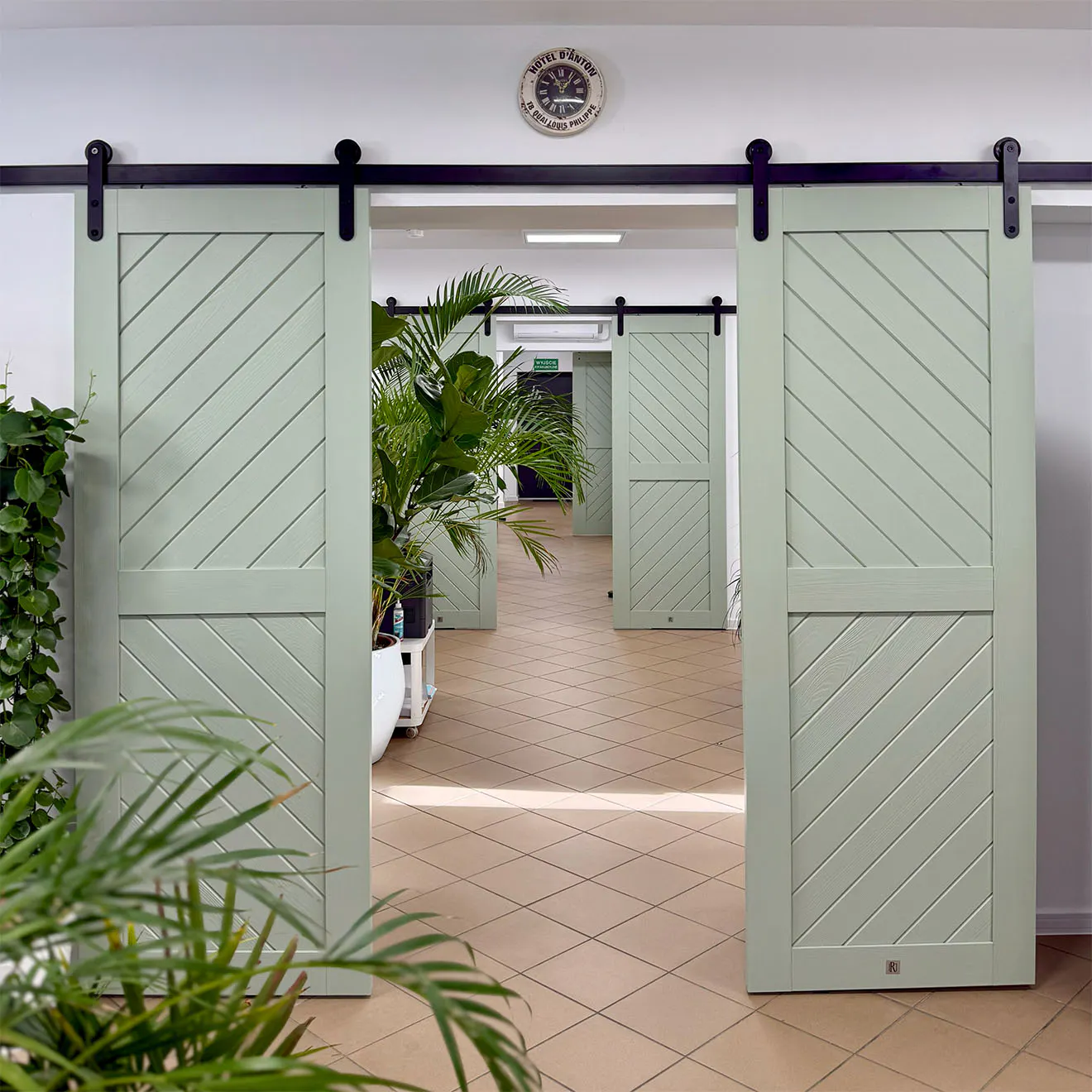
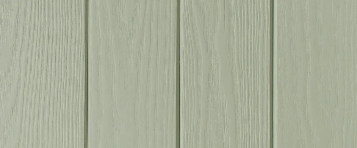
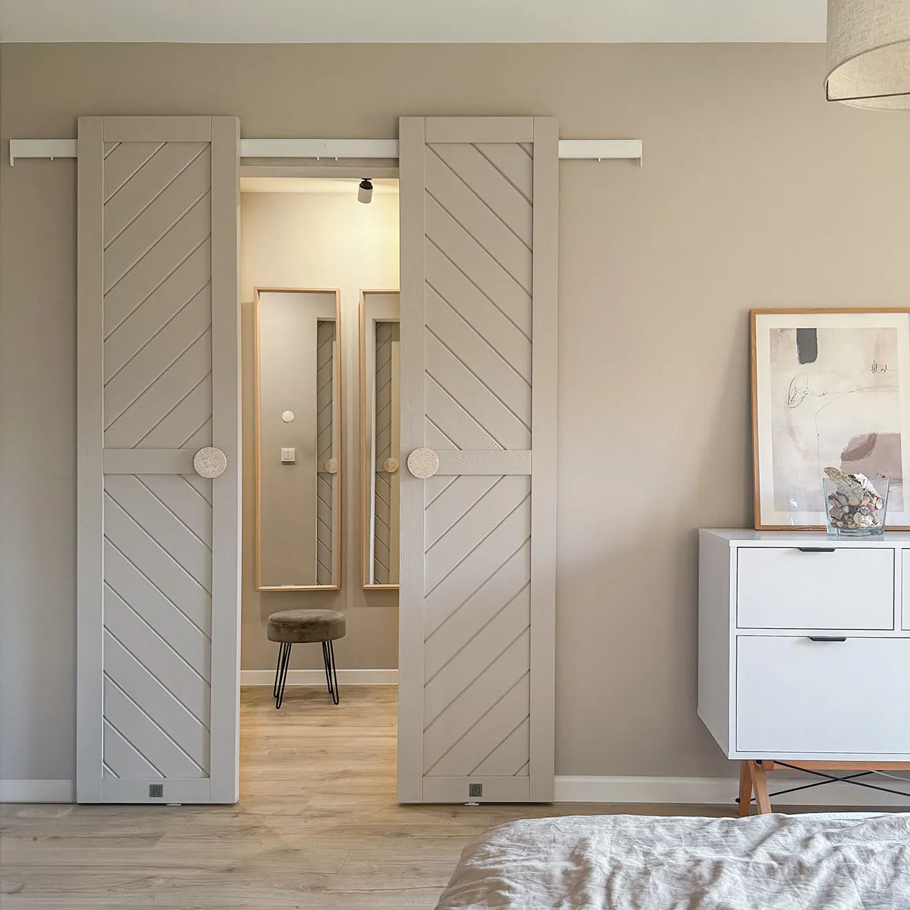

Why can the same door color look different?
In fact, there's no single 'right' color for wooden doors. And that's precisely where their greatest value lies.
Wood is a natural material – each board has different grain, a varying number of knots, and its own structure. That's why even two doors in the same color will never look completely identical. The color 'lives' with the wood, and its appearance changes through various influences.
What influences the color of wooden doors?
- Natural wood structure: Solid wood has unique properties such as grain patterns, knots, discoloration, and varying wood density. Harder areas absorb pigments differently than softer areas, creating a natural and beautiful color gradient.
- Wood brushing: Our doors undergo a brushing process. This treatment highlights the natural wood structure, so the color doesn't appear flat or uniform – it gains a three-dimensional effect.
- The type of finish: Oils penetrate deep into the wood structure and emphasize the natural matte finish and authenticity of the material. Stains and lacquers, on the other hand, form a protective layer on the surface that provides stronger color coverage and a more uniform appearance.
Why does a door's color look different in photos?
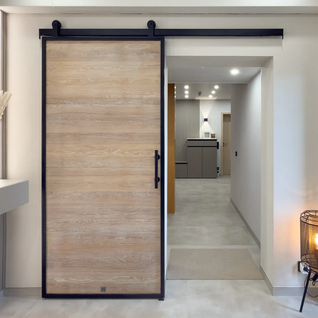
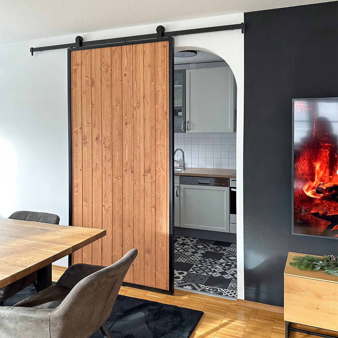
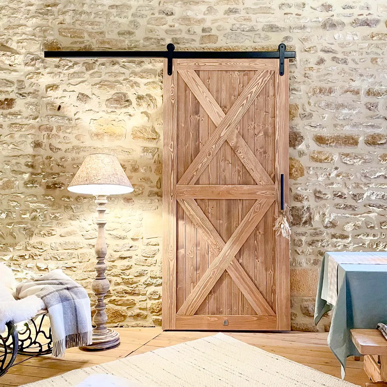
The same door can look completely different in two different rooms. That's perfectly normal, because color perception is influenced by several important factors.
- Light temperature: In warm light, the doors take on golden, cozy nuances. In cool office lighting, the same color tone may appear grayer or more subdued.
- Time of day and light exposure: In direct sunlight, wood appears lighter. In a shaded hallway, the color appears deeper, richer, and calmer.
- Adjacency effects (surrounding environment): Walls, flooring, furniture, and décor influence how you perceive the wood. Warm beige tones or an oak floor emphasize the warmth of the doors. Cool gray tones or concrete surfaces can visually cool even a very cozy brown.
- Camera and display: Smartphone cameras often automatically increase contrast or color saturation. Additionally, each monitor has its own brightness and color temperature settings, which affect the final result.
Remember! You're not simply choosing a color from a palette.
You're choosing a natural material that will look slightly different in your home than in a photo – and that's precisely what gives wood its special character.

Unsure about your color choice?
Order samples. Photos help, but only a real color sample shows:
- how the color looks in your lighting conditions,
- how it coordinates with your floor,
- whether it matches your furniture and walls.
We know that no screen can fully capture the texture and true depth of wood. That's why we offer the option to order physical samples. Hold them up to your wall, view them in daylight and again in the evening under lamplight. Only then can you be 100% confident.
Frequently Asked Questions (FAQ)
Is the door color in the photos realistic?
Not 100%. The photo serves only as a reference for the color direction. Your phone's screen, lighting conditions, and surroundings can change color perception by several dozen percent.
Will my doors look exactly the same as my neighbor's, who ordered the same model and color?
No. There are no two identical trees, and therefore no two identical doors. Wood is a natural material – variations in grain and knots are completely normal.
Which door color is the most versatile?
Cashmere, Taupe, and Macchiato – because they feel neutral and combine easily. Also Natural Oak – because it pairs well with most flooring.
Can I match the doors' color to my furniture?
Yes, but don't look for an exact color match. What's much more important is that the wood has a similar tone – feels warm, cool, or neutral. If your furniture has a warm oak tone, choose a warm oil tone, like Camel. The wood color doesn't need to match exactly – what matters more is creating a cohesive and harmonious look for your room.